Self-Publishing Diary: Cover Mock-Ups and Design
This week in my self-publishing diary it’s all about the cover mock-ups and design! First of all, I want to say thank you from the bottom of my (broken) heart to everyone who helped vote on my potential covers. (My heart isn’t actually broken, I just couldn’t resist a Britney reference.) You were a major help. I’m glad that most of you had the same aesthetic in mind as I did.
Choosing a cover is serious heart attack territory. It’s so stressful. You know how people say not to judge a book by its cover? Well, newsflash. That’s all people do! One of my girlfriends told me that if a book has a bad cover, she won’t even give it a chance. And not to sound completely selfish, but I’ve been known to do the same.
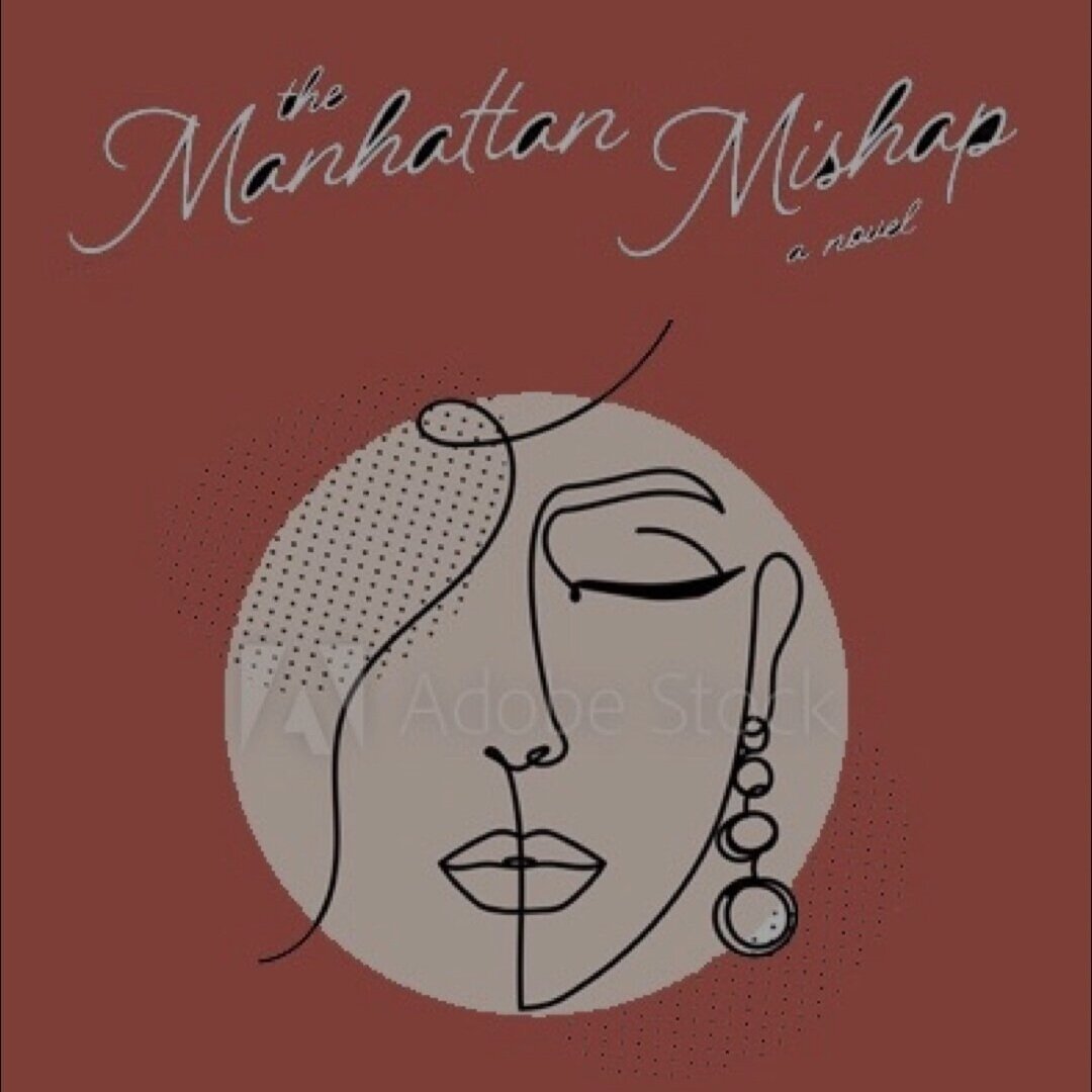
What can I say? I’m a visual person. Which is why I knew I had my work cut out for me when selecting and designing a cover for The Manhattan Mishap.
Self-Publishing Diary: Cover Mock-Ups & Design
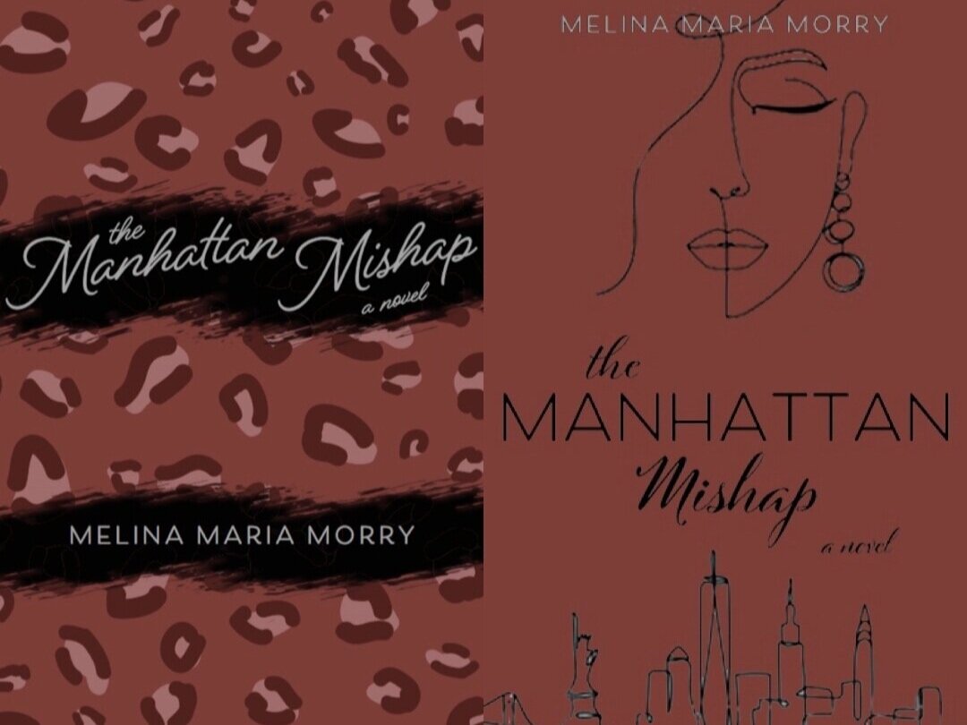
LEFT: 45% YES, 55% NO. RIGHT: 93% YES, 7% NO.
LEFT: 72% YES, 28% NO. RIGHT: 68% YES, 32% NO.
Not only do I want my cover to look incredible on a shelf in your local bookstore, it also needs to be ready for social media. And that means a gorgeous, aesthetically-pleasing appearance. Yes, first and foremost, I want people to read my novel and adore it. However, one of the major steps in getting to that point is marketing. (Currently, I have about 175 book marketing videos to work my way through. That’s not an exaggeration.)
I need people to find The Manhattan Mishap cover so attractive that they can’t wait to get their hands on a copy and post it all over their social media pages. Talk about it, blog about it, podcast about it, snap millions of photos with it.
With my self-publishing package, I have access to a graphic designer to help bring my vision to life. However, I am a very particular and detail-oriented person. I know this about myself all too well, which is why I was beyond nervous to get back the first round of cover proofs.
The options from the publisher were… interesting. Although they included a lot of the elements I’d requested in my extensive notes, none of the covers were 100% what I was after. I was stressing about it so badly. Weary of developing an ulcer or stress zits, I quickly opened Photoshop on my computer and got down to work recreating the covers with my own fierce touch.
What I ended up splicing together ended up getting the best results out of all of the covers! That made me very happy. I’ve now sent my mock-up back to the publisher with another round of excruciatingly detailed notes. Can’t wait to post my cover reveal when it comes back!
Next up: I should be getting the first round of manuscript edits back at the end of this month.
—ᴍᴍᴍ


